A trailer is a preview of a newly release film, it typically shows a large amount of the plot and so therefore can be quite long. The purpose is to engage the audience by showing what the film is about and presenting the plot.
Teaser Trailer
A teaser trailer is similar but doesn't show as much plot as a trailer would. This makes the film more illusive and is more likely to catch the attention of the audience.
Pacific Rim
This is a main trailer. This is obvious because it previews a lot of the film and reveals the storyline. There are many clips of the film shown, rather than titles or quick shots, which gives away a lot of the plot.
These screenshots are examples of the trailer giving away too much of the main plot as it shows the main events that happen and so doesn't leave much curiosity for the audience. These shots are also clearly big action scenes that happen in the film and, although they should give away some dramatic activity in order to draw in the audience, we feel like they didn't need to give away this much and also the clips were quite long. If they had shorter snippets of the scenes, it would make the trailer more dramatic, provoke tension and create wonder.
Positives
We thought the quick flash of black screens between each of the action pact shots were really effective because it built tension and the effect of going from silence and then to a loud scene taunts the audience and makes them want to see more.
We also felt, although there wasn't enough credits in between the clips, they were very effective and creative as the font contained what look like shadows and presented information via text rather than shots. The text used contributes to the dark genre and theme of the film as it's quite low key lighting. The film is obviously an action film, and so the font used is bold and in capitals and quite simple although it stands out. 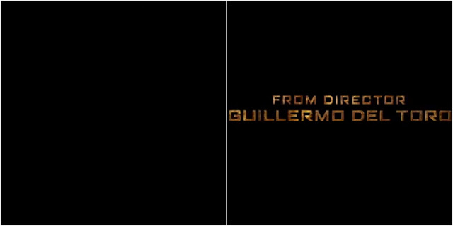
Man of Steel
This is an example of a teaser trailer. This is obvious because the clips are very short and rapid and don't give away much about the storyline.
We thought the music used, although was quite simple, we thought went well with the beginning of the trailer. However, it was quite mellow and didn't suit the type of genre that is was. You would expect the music to escalate over the corse of the trailer to something more powerful and gritty.
The trailer also contains a voiceover of the main character's father. We felt this was a good feature as it helped the audience get to know and relate to the main character's background and shows how important his father was to him, however what he was saying was quite boring and didn't really say much about the film plot.
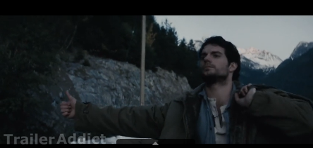 These print screens are examples of the beginning of the trailer. We felt that this doesn't really draw in the audience and it doesn't fit with the genre type as it's a Superman film and so typically, you would expect it to feature more action.
However, we think because it is the beginning of the trailer, it builds up the tension to the next events. Although the rest of the trailer doesn't really have many action type events.
Positives
We think this trailer is quite simple but we think it can afford to be simple as its very well known, by showing superman flying and then his logo teases the audience as the trailer only reveals small part of the main plot which can cause the audience to inquire about the film. By the screen fading in and out to a black screen and the superman logo only appearing on the black screen creates intensity as well as showing its significance.
Human Centipede 2
This is another teaser trailer, again this is obvious as the clips are very short and this is suitable for the film genre as it is horror and so you would expect quick clips being shown with the use of transitions such as fading in/out to a black screen.
The use of low key lighting throughout the trailer builds up the horror of the film and presents the genre well. By having low key lighting it can create the sense of uncertainty as it only highlights part of the clip and you're deprived of clear vision. The low key lighting could have been used as a metaphor to represent the darkness of the film.
By introducing new characters it anticipates the audience on what will happen and also shows that it is a sequel. By showing old characters reminds the audience what happened in the previous film and suggests that the first film influenced the main character in the sequel to create a human centipede.
We think that the font used in this trailer fit the genre well as its simple but the use of effects used makes it mysterious as the fog reveals the writing and the screen shakes which could represent someone shaking because of fear. The background the font appears on looks dirty which could represent the darkness of the film as well as where the film is set, in a warehouse.
The trailer also tells the audience when the film is released which is a good quality to a trailer as it prepares them for the film release. It is also informative for the audience and so can excite them for the release.
The music and sound effects used fit in very well with the genre of this movie as it's quite dark and the sound levels also increase and decrease at different points in the trailer which increases the feel of it. Also the sound effects and music included are in sync with the transitions of the different clips. The screams used in the trailer create dramatic effect for the audience and bring the story to life. It also braces them for the events that are going to happen within the films and makes it obvious that it is a horror film.
However, as the end of the trailer approaches, the music could become more dramatic to create tension and fear for the audience as it's quite simple and the same throughout the trailer.
We could only think of positive points in this teaser trailer and none negative because we thought that it lures in the attention of the audience and the music, font, use of low key lighting etc was very effective to feature in a horror genre.
Pompeii
Lastly we looked at another teaser trailer, this again had short clips which were rapid with the use of transitions.
The music used starts off quiet and slowly increases, the music reminds us of a volcanic eruption which could of been used to indicate the incident that occurred because of this. The music starts of slowly but escalates and gets louder, this could represent the build of events that are going to happen. The music is quite calming and high pitched which a contrast to what will happen in the film as death will occur. When the main events are shown the music gets more up beat and dramatic so that it is obvious to the audience it is an action film. We like the way the music is in sync with events in each clip, The music increases dramatically when a big event happens and also decreases rapidly when the credits comes up.
The voice over describes more of the feeling of what happened more than the actual events to keep the audience in suspense.
We liked the way the film shows the aftermath of the volcanic eruption and then dramatic events during the volcanic eruption. By the trailer doing this it catches the eye of the audience because it shows the starts and the end which is the most important and doesn't give away bits in the middle. Also by showing the ending it will cause curiosity to know what happened before.
We also liked how it sets the scene of the story plot straight away and you are able to identify the historic story behind the film.
In this teaser trailer, 2 main characters are introduced which we liked because it gives the audience an opportunity to see the main characters before viewing the actual film. It also presents that there is obviously chemistry between the 2 of them and so it introduces that there is also a love aspect. By introducing main characters the audience are also able to identify what sort of personality they might have.
Lastly we thought the font used was very suitable for the film as it looks quite memorable because the background is dark and the font is made significant as the colour is gold/bronze. By using the colour gold/bronze it could represent how old the story is and also the font used looks strong as if it is made of gold or bronze.

Man of Steel
This is an example of a teaser trailer. This is obvious because the clips are very short and rapid and don't give away much about the storyline.
We thought the music used, although was quite simple, we thought went well with the beginning of the trailer. However, it was quite mellow and didn't suit the type of genre that is was. You would expect the music to escalate over the corse of the trailer to something more powerful and gritty.
The trailer also contains a voiceover of the main character's father. We felt this was a good feature as it helped the audience get to know and relate to the main character's background and shows how important his father was to him, however what he was saying was quite boring and didn't really say much about the film plot.
 These print screens are examples of the beginning of the trailer. We felt that this doesn't really draw in the audience and it doesn't fit with the genre type as it's a Superman film and so typically, you would expect it to feature more action.
However, we think because it is the beginning of the trailer, it builds up the tension to the next events. Although the rest of the trailer doesn't really have many action type events.
Positives
We think this trailer is quite simple but we think it can afford to be simple as its very well known, by showing superman flying and then his logo teases the audience as the trailer only reveals small part of the main plot which can cause the audience to inquire about the film. By the screen fading in and out to a black screen and the superman logo only appearing on the black screen creates intensity as well as showing its significance.
Human Centipede 2
This is another teaser trailer, again this is obvious as the clips are very short and this is suitable for the film genre as it is horror and so you would expect quick clips being shown with the use of transitions such as fading in/out to a black screen.
The use of low key lighting throughout the trailer builds up the horror of the film and presents the genre well. By having low key lighting it can create the sense of uncertainty as it only highlights part of the clip and you're deprived of clear vision. The low key lighting could have been used as a metaphor to represent the darkness of the film.
By introducing new characters it anticipates the audience on what will happen and also shows that it is a sequel. By showing old characters reminds the audience what happened in the previous film and suggests that the first film influenced the main character in the sequel to create a human centipede.
We think that the font used in this trailer fit the genre well as its simple but the use of effects used makes it mysterious as the fog reveals the writing and the screen shakes which could represent someone shaking because of fear. The background the font appears on looks dirty which could represent the darkness of the film as well as where the film is set, in a warehouse.
The trailer also tells the audience when the film is released which is a good quality to a trailer as it prepares them for the film release. It is also informative for the audience and so can excite them for the release.
The music and sound effects used fit in very well with the genre of this movie as it's quite dark and the sound levels also increase and decrease at different points in the trailer which increases the feel of it. Also the sound effects and music included are in sync with the transitions of the different clips. The screams used in the trailer create dramatic effect for the audience and bring the story to life. It also braces them for the events that are going to happen within the films and makes it obvious that it is a horror film.
However, as the end of the trailer approaches, the music could become more dramatic to create tension and fear for the audience as it's quite simple and the same throughout the trailer.
We could only think of positive points in this teaser trailer and none negative because we thought that it lures in the attention of the audience and the music, font, use of low key lighting etc was very effective to feature in a horror genre.
Pompeii
Lastly we looked at another teaser trailer, this again had short clips which were rapid with the use of transitions.
The music used starts off quiet and slowly increases, the music reminds us of a volcanic eruption which could of been used to indicate the incident that occurred because of this. The music starts of slowly but escalates and gets louder, this could represent the build of events that are going to happen. The music is quite calming and high pitched which a contrast to what will happen in the film as death will occur. When the main events are shown the music gets more up beat and dramatic so that it is obvious to the audience it is an action film. We like the way the music is in sync with events in each clip, The music increases dramatically when a big event happens and also decreases rapidly when the credits comes up.
The voice over describes more of the feeling of what happened more than the actual events to keep the audience in suspense.
We liked the way the film shows the aftermath of the volcanic eruption and then dramatic events during the volcanic eruption. By the trailer doing this it catches the eye of the audience because it shows the starts and the end which is the most important and doesn't give away bits in the middle. Also by showing the ending it will cause curiosity to know what happened before.
We also liked how it sets the scene of the story plot straight away and you are able to identify the historic story behind the film.
In this teaser trailer, 2 main characters are introduced which we liked because it gives the audience an opportunity to see the main characters before viewing the actual film. It also presents that there is obviously chemistry between the 2 of them and so it introduces that there is also a love aspect. By introducing main characters the audience are also able to identify what sort of personality they might have.
Lastly we thought the font used was very suitable for the film as it looks quite memorable because the background is dark and the font is made significant as the colour is gold/bronze. By using the colour gold/bronze it could represent how old the story is and also the font used looks strong as if it is made of gold or bronze.




No comments:
Post a Comment