For our magazine cover, we wanted to do something really different but at the same time, typical and that relates to our genre and our trailer plot.
Our first idea was to have Ella (Laura) on the front page, sort of like our poster. However, we wanted to have a full body shot of her wearing typical teenage girl clothes and holding a balloon preferably red or black because these colours are typically associated with horror/thriller genres.

We really like this idea and were influenced by the films above, The Shining and The Grudge. We like the idea of making girls look really sweet, innocent and normal but underneath, they're actually evil but the audience can't see this because of their disguise.
Setting
We want the setting/background of our magazine cover to be in a woods. We think the woods is a good place to have this because they look really creepy because of all the shadows that surround it. We also used a woods setting in our actual trailer so this would relate to it as well as having our main character on the front of the magazine.
Photoshop Tools
When editing our magazine, we will be using photoshop. On photoshop, there are many tools that we will probably be using to ensure that our magazine is perfect and looks professional.
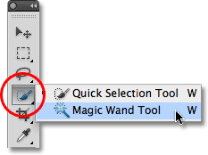
The magic wand tool allows you to remove any excess background that you may not want/need on your photo. We may have to use this tool when editing our magazine cover incase there are any parts of the background that we don't want to be there.
The crop tool will also be a tool that we could use when editing our magazine cover. We may need to crop around the photo so that each side is even and that Laura (Ella) is centred in the middle of the photo. This will make the photo look more professional and therefore improve the magazine cover immensely. There may also be people/objects in the background of the photo that we possibly may not have noticed when actually taking the photo so we may need to crop these out too.
We may also want to use the blur, sharpen or smudge tool when editing our magazine cover. The blur tool would help to make the background slightly out of focus, emphasising the main object of the photograph which will be Laura (Ella). It will make her look more obvious and make the audience automatically drawn to her rather than anything else that's happening in the photo. We may also want to use the sharpen tool. This tool increases the pixels in a certain photo, making it look more sharp and therefore, standout. Basically the opposite to the blur tool. And finally, we may want to use the smudge tool when we come to edit our magazine. This allows us to smudge the photograph so everything in the image moulds together so it just looks like a big blur. We are less sure about using this effect, however we could adjust the amount and use it slightly to add more of an effect to the background or to Laura (Ella) herself.
Finally, any of these edits could be used on our image to improve the appearance of it. Each edit does something different to the image, increases/decreases the saturation, brightens it or darkens it etc. We will probably use the effect that decreases the light intensity the most as we want our poster to be quite dark to make it look more scary and horror like. We may also use 'Vivid light' to highlight certain areas of the image and possibly to increase the shadows around the trees/bushes in the woods to make it look more spooky and intense.
At the end of our image editing, we want our magazine background image to look something roughly similar to the image below:
Idea 2
Our second idea for our magazine cover was slightly similar to our first. We know that we want our magazine cover to have Ella (Laura) on the front, in the centre of the image so she stands out and it's obvious she's the main subject of the poster. However, we weren't certain exactly how we wanted Ella to be pictured or what the background would be.
Our second idea was, again to have Ella standing in the middle of the image like the examples below:

We felt this presented Ella as the main character which gave the audience an idea of what the film could possibly be about.
We then decided that, unlike our first idea when we had the woods in the background, we could have the house that Ella becomes obsessed with in the background. This would present more of the storyline to the audience and help the magazine cover relate to our film.
Setting
Above is the house that Ella becomes obsessed by. Our idea then was to picture Ella standing in front of the gate looking extremely spooky and almost possessive.
Photoshop Tools
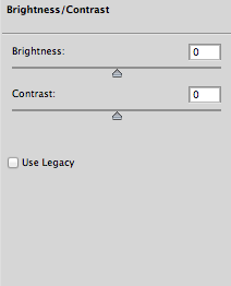
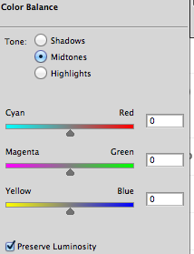
When using Photoshop on our second idea we thought it would look good if we make it as dark as possible. We thought it would look good to have the poster looking dark so that the audience get the idea of what the genre is straight away. The tools below are what we will use to achieve this.
 We will first adjust the brightness and contrast, when using this effect on our poster it made Ella look darker and so fade into the background which was black. We liked the idea of this as it made Ella look mysterious as her features weren't clear due to the darkness.
 After changing the brightness/contrast we will adjust the colour balance. We edited the colour balance on our poster and we liked the effect is made when changing the colour to blue, we did this slightly to again add the effect of darkness and mystery.
 Lastly we will change the edit of the magazine, as said before each of these edits will give the magazine cover a different appearance. As we want to make this magazine cover look as dark as possible we will probably pick either darken, dissolve or hard light. Darken will obviously make the picture look darker, dissolve will make the picture have a faded look which adds to the effect of mystery and hard light highlights certain features of the picture which we thought would look good.


No comments:
Post a Comment