Friday, October 11, 2013

Title: Take Your Soul Ideas


The first font we looked at was called 'I Still Know', we liked the style of this as just like all the others it was quite simple but had something little that made it different. We also liked how each letter wasn't completely black as if its old and was fading away. We thought this font suited the genre 'Horror' well as by having an old looking effect made it look more creepy.


The second font we looked at was 'SF Gushing Meadow', we liked this font as we liked the blood dripping effect it had on each letter. Again this suited the genre 'Horror' well as each letter looked as if blood was dripping off of it. We thought that this font was a bit too much like our production logo which had blood looking effects on it and we wanted something a bit more plain for our film title.


The third font we looked at was 'Optimus Princeps', this font was very simple and plain which is what we liked about it. When looking at other Horror trailers we saw a pattern of all titles being quite simple and had no effects like blood dripping or an old creepy effect, just like this font. We decided to look at fonts that were simple just like in other horror trailers as we liked the idea of our title font to be simple.


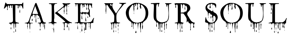
Lastly, the fourth font we looked at was 'Fuehrer', this was quite similar to 'SF Gushing Meadow'. We liked this font as it looked more scary because the font was more bold and so would stand out more also the blood effect on each letter was more dramatic and so again emphasised the genre 'Horror'. Out of all the fonts we thought this was the most scariest.
Fue

Character Influences


We think our main character, Ella, is a lot like the sort of characters that Amanda Seyfried plays. She usually plays quite normal, innocent girl roles and also seems to be quite kind and genuine. We want Ella to come across like this so it contrasts with what happens to her in our film. Amanda’s style is also quite simple but at the same time, fashionable, in many of her films. We wanted Ella to achieve this so she comes across as a normal, young girl to the audience. 


We think friend 1, Sophie Wright, would definitely be a lot like the characters that Mila Kunis stars as. Generally, her characters are extremely funny and down to earth people that like having a good time and are loyal to their friends. We see a lot of her character like this when she plays ‘Jamie’ in ‘Friends With Benefits’ and also ‘Lori’ in ‘Ted’. We are hoping to achieve a character like this with Sophie Wright. Also, the style that Mila wears when playing these characters is very casual but stylish and we want Sophie to portray this style. 


Finally, we think that Alice Jones would be most like Ariana Grande. Although Alice is quite 2-faced, she’s also quite innocent and naive. Ariana is like this when starring as ‘Cat’ in ‘Victorious’. Also, Ariana’s fashion sense is quite girly and pretty and we wanted Alice to dress like this, so the 3 friends have 3 different types of fashion style but they’re still best friends. This also gives it a bit of a difference as it would be very plain and boring if all 3 characters dressed the same.  

Tuesday, October 8, 2013

Practice Production Logo: Finished


This is what our finished practice logo looked like. We liked the font as it we thought it suited our genre (horror) very well. We also liked how each letter came in one by one as it looked as if someone was typing it. We decided to have this logo as our practice logo because we thought this logo was quite basic and was very similar to our last logo in our last project. We wanted to do something a bit different and so decided to change how the logo entered and exited. We kept the idea of the logo looking as if someone was typing each letter by making sure each letter came in one by one, bad film and bad TV to emphasize a spooky effect.

Practice Production Logo: Edits

 These are the edits that we did for our Practice Production Logo. We wanted each letter to come in after the other to give a an effect that someone was typing it. To do this, we decided to use Adobe Fireworks CS5 because we have experience using it and we also knew that we could add different states to ensure that each letter entered one after the other and for the same amount of time.


Above are the print screens of the states. There are 11 states because 'Tremor Films' has 11 letters. We made it last 27 seconds to make sure that the audience were able to read what our production logo was called and also because we wanted it more slowly to emphasise the creepiness of the letters being typed.


The print screens above show how our letters come in one by one.
This was originally going to be our production logo but we felt that it was quite basic and boring and that we could do more with it. We also felt that it was a lot like our other logo that we did in our previous project and so decided to change a few things.

We kept the basic idea of each letter coming in one after the other because we liked this effect. However, we decided to make the background black to relate to the genre because black is associated with fear and darkness.
We also added a number of affects onto our other production logo in comparison to this one (see other blog post)

Production Logo: Finished


This is what our production logo looked like finished. On YouTube the colours come up a bit lighter than it actually is. We liked how the effects we used emphasized our genre (Horror). Bad Film added an old look to the font which we thought made the logo look more spooky, Earthquake made the font look shaky and so represented our name ‘Tremor’ and lastly Bad TV also had a shaky effect which contributed to the emphasizing our name of our production logo ‘Tremor’ as tremor is when you are shaken by something scary and this font and earthquake gave off this effect. As well when using Bad TV it looked as if a camera was breaking which made our logo look even scarier. When all these effects were used together we thought they fitted very well and worked smoothly.
At the end we made some of the Bad Film effect shorter so that the actual colour came through on some letters as it exited the screen, this made it look like blood. We also liked how each letter went off separately with the effect of Bad TV as it looked as if the camera was breaking which suited the effect being used as Bad TV made the font look as if a camera was breaking. By having the font shaky it represents our name ‘Tremor’ and also a human as we made our logo look as if it was a human shaking from fear. By having the font red it also relates to having our logo represent a human but instead of shaking from fear it looks as if the human is shaking from the fear of being killed.

Wednesday, October 2, 2013

Character Development

In this post we show each character and what type of style and personality they have.


Film Shots Influences

Below are some of our favourite shots from our top 5 horror films. By looking at each trailer we were able to identify shots that we liked the best and influenced to decided what type of shots to use in our trailer.

Insidious


Establishing Shot

We felt this shot was good because it established the main location and the main reason of the plot was because this house was contaminated with demons so by using this shot, it identifies this to the audience. We wanted to use something like this in our trailer so we could emphasise the plot more and make it obvious to the audience. We would also like to pan up our establishing shot slowly to give more effect. 


Close Up
We felt that this was a good shot to use in our trailer. It really influenced us because we wanted to also have a clip of our main character lying in bed to emphasise the beginning of what starts to happen to her. This close up is really effective because it shows us the main subject of the shot, and it also emphasises the background by still having it in the shot. We can tell by this shot that something is going to happen in the background of the shot even if it hasn’t happened yet. We want to get this feeling when filming our trailer. 


THE CONJURING


Establishing/Wide Shot

This was one of our favourite shots that we chose. We loved how the shot, at the beginning, had an old fashioned film effect to it, and then gradually went into focus and changed into colour. It just gives the feel that this house is very old and something happened here a long time ago and emphasises this for the audience. It also, at the same time, establishes the location and slowly zooms into it, which automatically makes the house creepy and makes the audience suspect something. We are hoping to achieve something like this with our trailer to present the main location.


Close Up
We really liked this close up as it gave a feel to the genre by the presentation of the prop. We think it's quite creepy and gruesome and links to our chosen theme for our trailer. We also love the fact that it's in black and white because it makes it look more dated and old-fashioned which emphasises the horror. We want to use a prop like this in our trailer because we have a teenage girl as our main character and the doll could emphasise the loss of her childhood.


MAMA


Wide Shot 1

We loved this shot because, although the girl in the shot is clearly the main subject, it doesn’t emphasise her existence. Instead, it focuses on a child’s toy/play area in the room which she clearly isn’t going to play with. This creates a contrast within the shot. The girl is clearly abnormal and isn’t like other children so she’s not going to play with the toy, but it still takes up nearly all of the shot. We also liked the way the girl is huddled into the corner. We think it makes the shot quite creepy and emphasises that she clearly isn’t normal. We want to have something like this in our trailer so we are able to make the changes in the girl more obvious. We want to present how normal she is in some shots, and then show how she gradually starts changing. 

Wide Shot 2


Long Shot
This is another wide shot that we liked from the trailer of ‘Mama’ We felt that this was a great shot 
because it presents the girl abnormality and also shows her room which seems pretty normal in comparison, which creates a contrast. We love how the girl is immediately presented as not normal after what’s happened to her. The shot, again, doesn’t actually focus on the girl herself, which makes the shot spookier when the audience does eventually spot the girl under her bed. 


Mid Shot/Two Shot
We liked the contrasting in this shot. We felt that the little girl is clearly troubled and had a difficult upbringing, but the close up of a ‘beautiful’ butterfly contrasts with her and she stares at it. The fact that the girl is also drawing on the wall emphasises the strangeness about her. 


SINISTER


Close Up
This is a close up of a young child’s drawing. We really liked this because it presents something that happened previously in the film through a drawing. The picture is quite creepy and because it’s a child’s drawing, it makes it more ‘sinister’. We wanted to include something like this in our trailer. We like the idea of a child drawing what happened/what’s happening to them rather than saying it aloud. We thought this was a really effective shot. The use of low-key lighting around the room really emphasises the object in the middle of it. Also, the fact that the box is the only item in the room makes it significant and emphasises its importance. An attic is also a typical location for horror movies so we thought it was good to have this location. 


Long Shot
We thought this was a really effective shot. The use of low-key lighting around the room really emphasises the object in the middle of it. Also, the fact that the box is the only item in the room makes it significant and emphasises its importance. An attic is also a typical location for horror movies so we thought it was good to have this location. 


This shot is the scariest shot of all of the ones we chose. It relates to our trailer because we wanted to some sort of ‘demon’ always following the girl so she could always see him. This shot was taken from a window and is from the point of view of the main character. After this shot is taken, the ‘masked man’ disappears when the main character blinks, which we found really effective and different. The use of low-key lighting here also emphasises the ‘masked man’ and helps the audience to know what to look at and identify him.

THE POSSESSION 


Close Up
We really liked this shot because it contrasts between the beginning and end of the film. This shot was taken at the beginning of the film, and shows the happiness and normality of the young girl and also her closeness with her father. However, the audience are aware of the plot while watching it, and so know that something is going to occur to her and makes her significant. We want to use a shot like this in our trailer to show how happy the girl is at the beginning and how she is unaware of anything she is about to go through. 


Wide Shot
This was another one of our favourite shots. We felt that the low-key lighting makes it really creepy and effective, and the use of the light from the window highlights the girl and makes her significant. We also liked the fact that she sat bolt up-right in bed which emphasises the start of her change. We want to include a shot like this in our trailer to show the audience she is beginning to change and for the main character to wonder what’s happening to her.


Close Up
Finally, we really liked this close up of the girl. Her eyes opened really suddenly in the scene and we like this because it shows she’s not normal and something is starting to happen. The fact that the audience can only see one of her eyes as well makes it a lot creepier and unsettling. Also, the lighting highlights only her face and nothing else around her, which emphasises her and also makes the audience think what could be in the room with her at that point.